The Most Hated Mandatory Purchase in the UK
Car insurance is not optional. Every driver in the UK is legally required to have it. And yet, buying it online is one of the most friction-heavy, abandonment-prone digital experiences in financial services.
The average direct insurer makes you answer 30 to 60 questions before showing you a price. Quote abandonment sits at around 84% — a number that surpasses even e-commerce (around 70%). Only 10 to 20 percent of people who start a quote actually buy a policy. For a product that is mandatory and repurchased annually by millions, this is a remarkable failure of execution.
The product can’t be the problem. Everyone needs it. The journey is the problem.
What These Journeys Actually Look Like
Every UK direct insurer follows roughly the same information architecture, though pacing and visual design vary:
- Step 1 — About You (~8–12 fields): name, date of birth, address, employment status, job title, home ownership, licence type, residency status.
- Step 2 — About Your Car (~8–10 fields): make, model, year, trim, value, purchase date, modifications, dashcam, overnight parking location; multiplied by cars (in multi-car policies)
- Step 3 — Driving History (~6–10 fields): years licensed, no-claims discount, claims in the last five years (date, type, fault, value), motoring convictions, penalty points, medical conditions.
- Step 4 — Additional Drivers (same fields again, per driver): this is where multi-driver policies balloon to 70–80+ data points.
- Step 5 — Cover & Quote (~5–8 selections): policy start date, cover type, voluntary excess, annual mileage, usage type, add-ons.
Total: 40–60+ data points for a single driver, 70–100+ for multi-driver/multi-car policies.
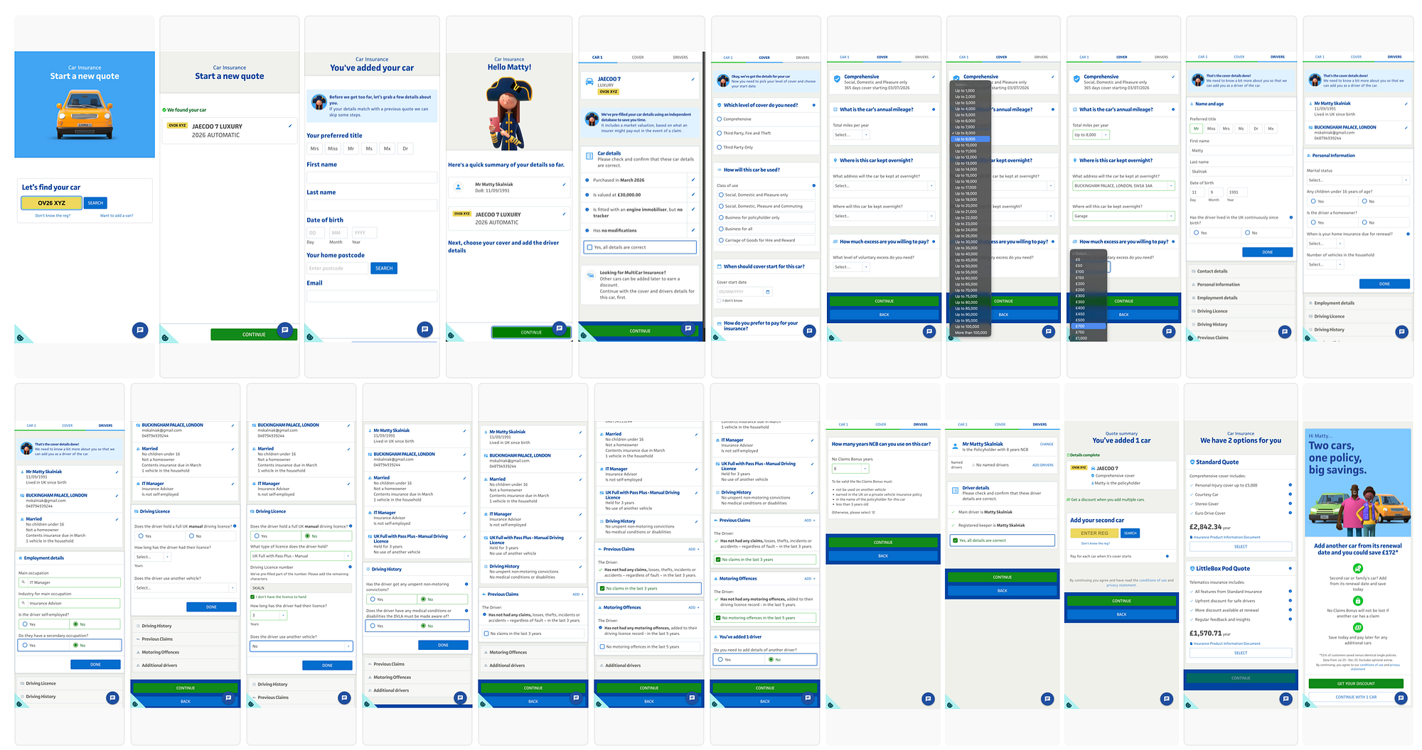
I tested two UK carriers recently. The first took me through approximately 50 questions before I could see any price — in the happy path, no edge cases triggered. If I wanted to compare five insurers, I’d need to block out an hour of my day. That is insane for a commodity product.
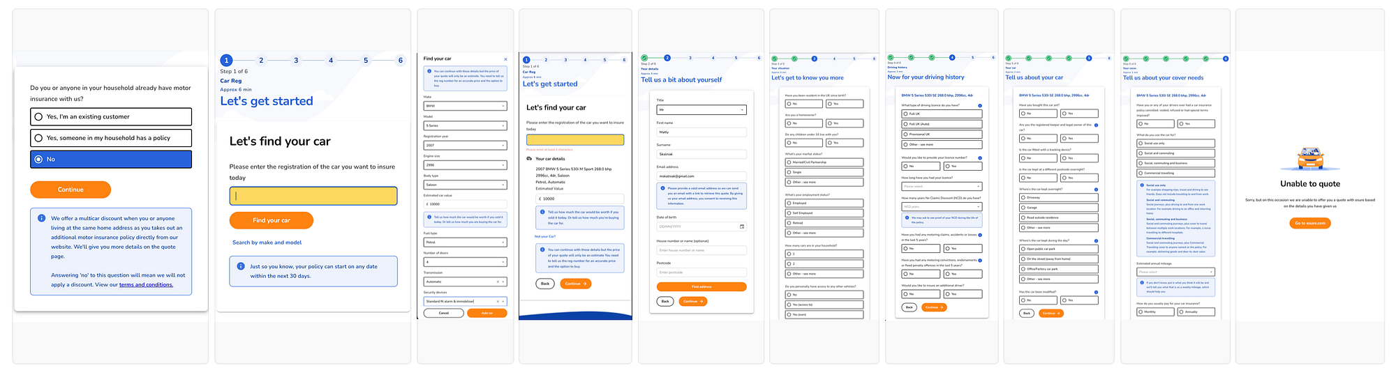
The second journey was shorter, around 35 questions, but had a worse outcome: I completed the form and didn’t get a price at all. No explanation, no ability to edit my answers. A dead end after investing all that time. This is the second most common reason people abandon: not just that the journey is long, but that it can end in silence after you’ve already committed to it.
It’s worth noting this covers only the quote stage, after seeing a price, users still need to provide additional information before the purchase is complete.
Why Is It Like This?
Three overlapping causes:
Legacy processes. Most UK insurers built their quote forms before data APIs existed at scale. Every question was answered manually because there was no alternative. Those forms calcified into systems, and nobody went back to prune them. The question count accreted over years of regulatory updates, fraud-prevention additions, and product team decisions, never subtractions.
Commercial and legal incentives to keep questions. When a user self-declares their claims history, the insurer can void the policy if the user lied. If the insurer pulls the same data directly from the Claims & Underwriting Exchange (CUE), that legal defence weakens. The question exists not because the insurer lacks the data, but because having the user self-declare shifts liability. This is a deliberate architectural choice, not a technical constraint.
Off-the-shelf systems with baked-in journeys. Many insurers run policy administration platforms with pre-built quote-and-buy flows. When the underlying system presents 50 questions, changing that requires either significant integration work or political capital nobody wants to spend on “just the form.”
The result is a product built for today, running an interaction model that hasn’t materially evolved in over a decade.
The 9-Question Journey That’s Technically Possible Today
This is not speculative. Every API required for this exists, is commercially available, and requires no FCA authorisation beyond what any insurer already holds.
1. Car registration plate
→ Auto-fetches: make, model, year, trim, fuel type, colour, MOT history with actual mileage readings, estimated current market value.
Sources: DVLA Vehicle Enquiry Service, DVLA MOT History API, CAP HPI for valuation
2. Your postcode
→ Auto-fetches: full address to pick from, area risk score.
Source: Loqate or Royal Mail PAF
3. Date of birth
→ Derives: age band — the single largest pricing factor in UK motor insurance.
4. How long have you held a full UK licence?
→ Simple selector: under 1 year / 1–2 / 2–5 / 5–10 / 10+ years.
5. What best describes your occupation?
→ Eight categories: Professional/Management | Office/Admin | Trades/Manual | Healthcare | Education | Retired | Student | Other.
→ AI maps selections to underwriting occupation codes. Not 500 options in a dropdown.
6. Any claims in the last 5 years? (Yes / No)
→ If Yes: how many? (1 / 2 / 3+). Claim detail collected at bind, not at quote.
7. Any motoring convictions or penalty points? (Yes / No)
→ If Yes: collect detail. If No: move on.
8. Any modifications to the vehicle? (Yes / No)
→ If Yes: free text or category list.
9. When do you want cover to start?
→ Date picker, defaults to tomorrow.
That’s it. Everything else defaults:
- Cover type: Comprehensive (user can downgrade on the results screen)
- Voluntary excess: £250 with a slider on the results screen
- Add-ons: shown post-quote, not during the journey
- Annual mileage: pre-filled from MOT history odometer readings, editable
- Overnight parking: derived from postcode risk data
- Business use: a toggle on the results screen
For a clean driver with no claims, no convictions, no modifications, and no additional drivers, the statistical majority, questions 6, 7, and 8 are single taps. Screen time under 90 seconds.
No FCA special authorisation. No DVLA MyLicence agreement. Available to any startup tomorrow.
Key Friction Points That Compound the Problem
Even within the existing 40-question paradigm, most journeys compound the problem with poor execution:
No honest progress indication. Many journeys show step counts that don’t reflect question counts. A journey that says “Step 2 of 5” but contains 18 questions on step 2 is actively misleading. Users feel trapped.
Dead-end declines. The user completes 35 questions, submits, and receives a message saying the insurer cannot offer a quote — no reason given, no ability to modify answers, no alternative. This is the worst possible outcome and is not rare. Underwriting rules are real and necessary, but presenting them as a silent wall after the user has invested significant time is a failure of design and communication.
Form density on mobile. Over 60% of UK insurance quotes are now started on mobile devices. Multiple form fields per row, small tap targets, font sizes that require zooming, and layouts that weren’t designed for a mobile viewport cause errors that frustrate users mid-journey. Most insurers’ forms were built desktop-first and adapted poorly.
Questions that feel irrelevant. “Are you married?” “Do you have a second job?” “Do you own your home?” Users understand that risk factors exist, but they don’t understand why civil status or home ownership affects their car insurance premium, and insurers rarely explain. Questions without obvious purpose erode trust.
The long dropdowns. Hundreds of options in an alphabetical list. No search. No grouping.
Something Less Really Means More
The instinct to ask more questions comes from a reasonable place: more data means more accurate pricing, better analytics, fewer edge cases, etc. But this logic breaks down when it produces an 84% abandonment rate. A perfectly priced quote that nobody completes is worth nothing. A slightly less precise quote that users actually receive and can act on is worth everything.
The question is who is brave enough to push it through.
References
- PropAir (2025) — The Hidden Cost of Slow Response: How Insurance Companies Lose 84% of Leads to Quote Abandonment — propair.ai
- EasySend (2023) — 7 Digital Customer Journey Trends in Insurance for 2025 and Beyond — easysend.io
- Digital Insurance (2021) — How to Cut Friction from Insurance Customer Experience — dig-in.com
- Pancentric Digital (2023) — UX Benchmarking of UK Car Insurers: Quote & Buy Review — pancentric.com
- Experience UX (2015) — 10 Lessons Learnt from UX Testing 70 Online Insurers — experienceux.co.uk
- Multiple industry sources — mobile share of UK insurance quote traffic, various 2024–2025 reports.
The author has worked in Guidewire Digital Portal development since 2018.