Closing the Loop
In the first article, I showed how a UI prototype can be built from inspiration screenshots in a matter of hours. In the second, I showed how that prototype becomes a demoable customer process — a working FNOL flow driven by acceptance criteria, not manual design work.
Both of those steps serve the same purpose: validate before you build. Get real reactions from stakeholders before anyone touches production code.
Now the validation is done. The prototype has been approved. The demo landed well. It’s time to build, and that means the UI component work has to start.
Why This Step Is Usually Painful
In a traditional digital transformation project, the handoff from prototype to development is one of the most expensive transitions in the process.
A designer takes the approved concept and recreates it in Figma, with real components, consistent tokens, spacing rules, and state variants. A frontend developer takes those Figma specs and implements them as code. A third pass happens to align the two. Then something changes in a stakeholder review, and the cycle repeats.
This is not a dysfunctional process. It’s the standard one. But it’s slow, it involves many parties at every change, and the gap between what the designer specified and what the developer implemented is a permanent source of small inconsistencies that compound over time.
The goal of this step is to give UI designers and frontend developers a shared, reliable tool — a design system — so they can focus on their actual work instead of resolving handoff friction.
The Process
The prototype built in cauliflower.studio is the starting point. It’s already visually coherent — the components are defined, the visual language is established, the spacing and color decisions have been made and validated.
From here, the process is a single prompt to Claude Code, connected to the Figma MCP Server:
“Use Lychee mockup and export the design into Figma. After that, based on the used components, create Design System components within Figma to be able to use when designing screens of the application.”
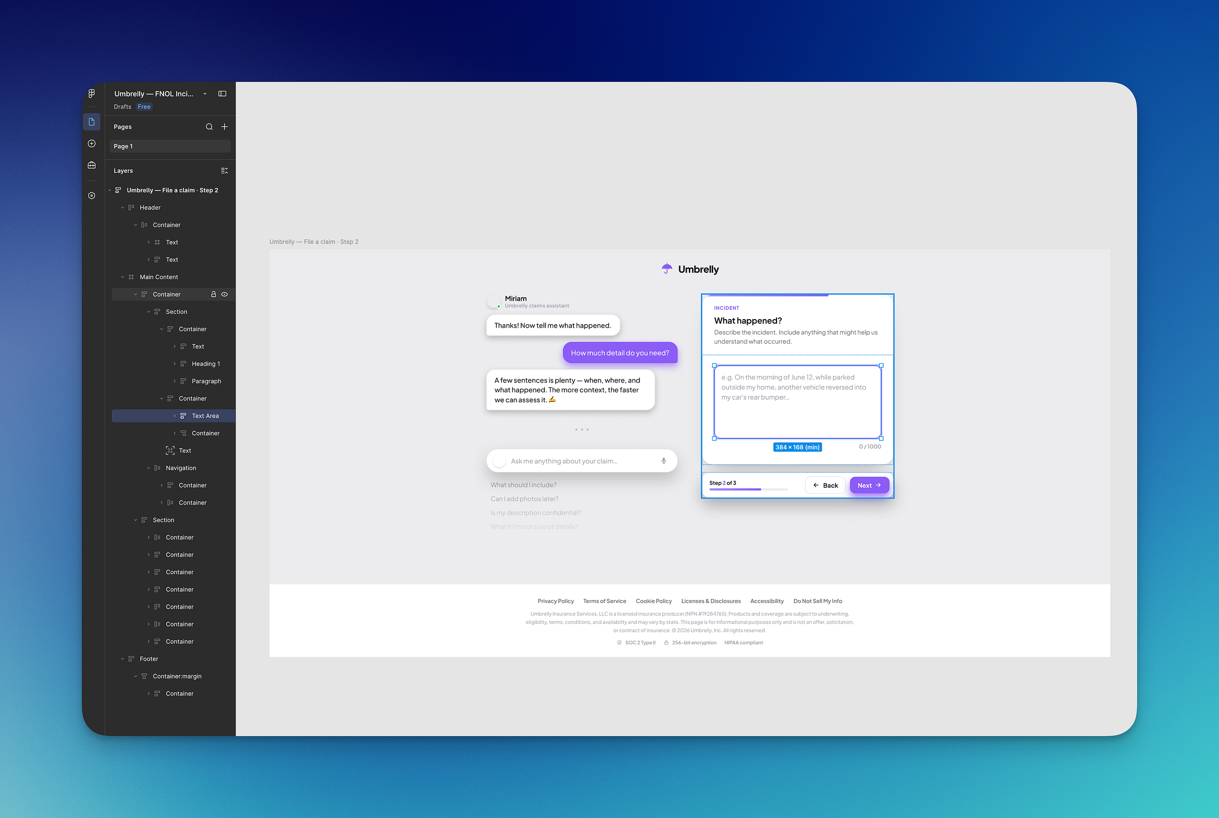
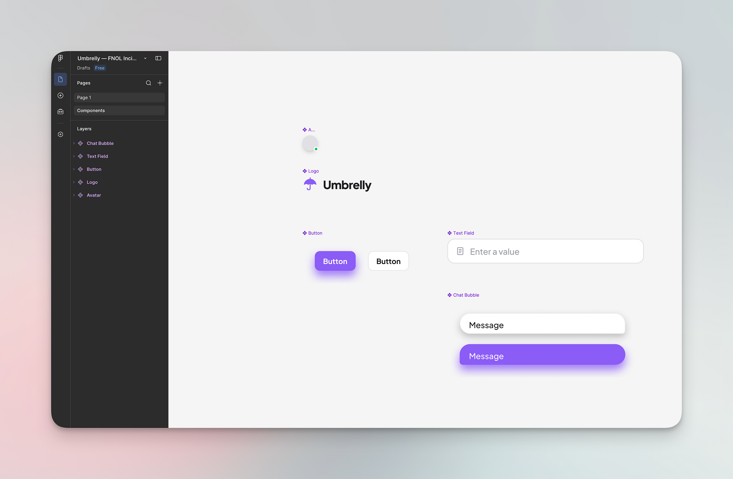
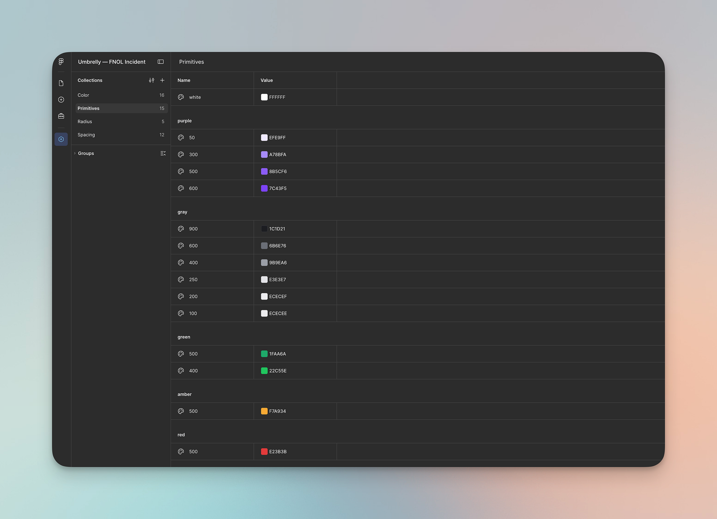
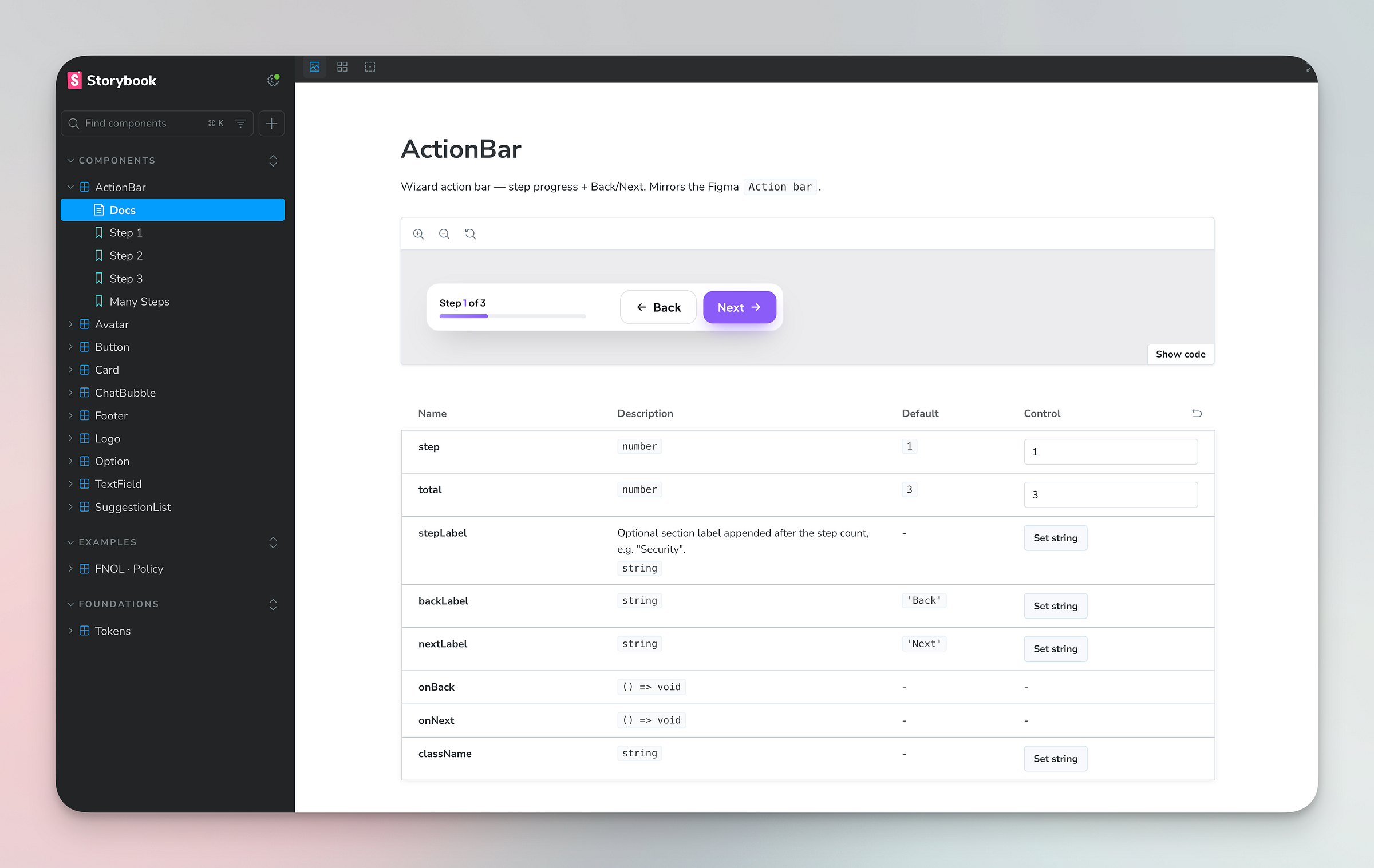
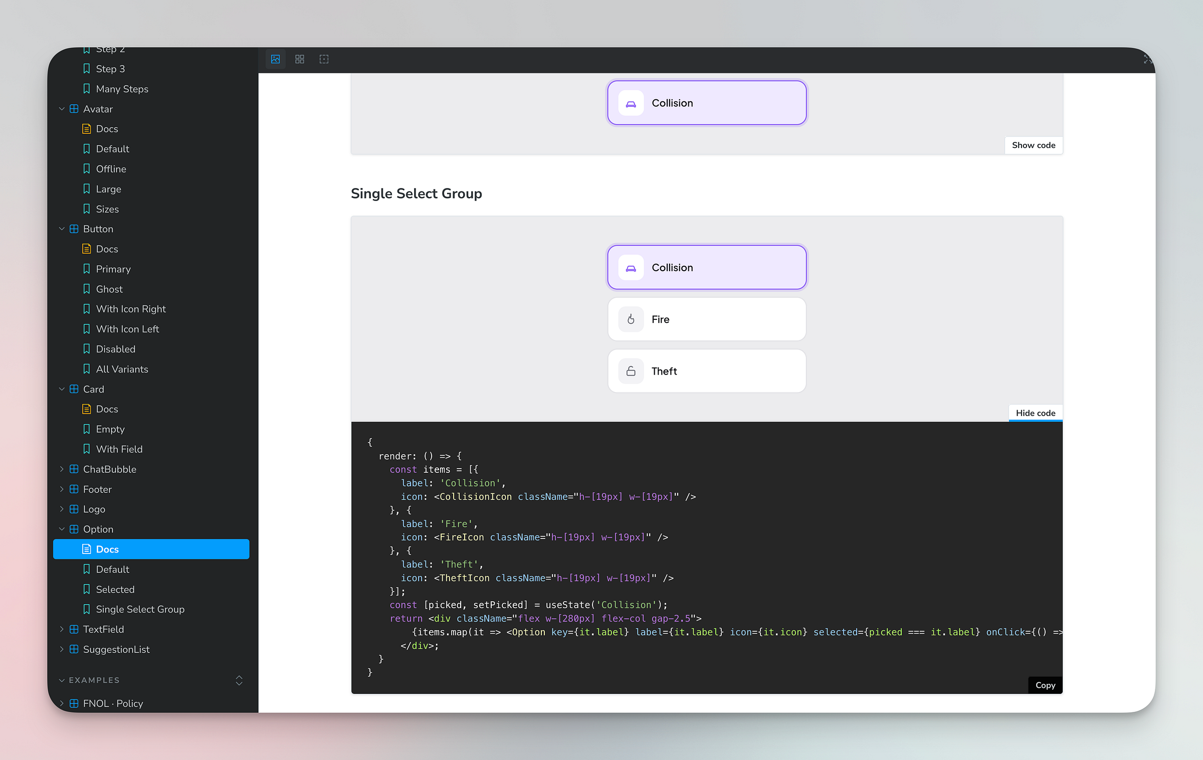
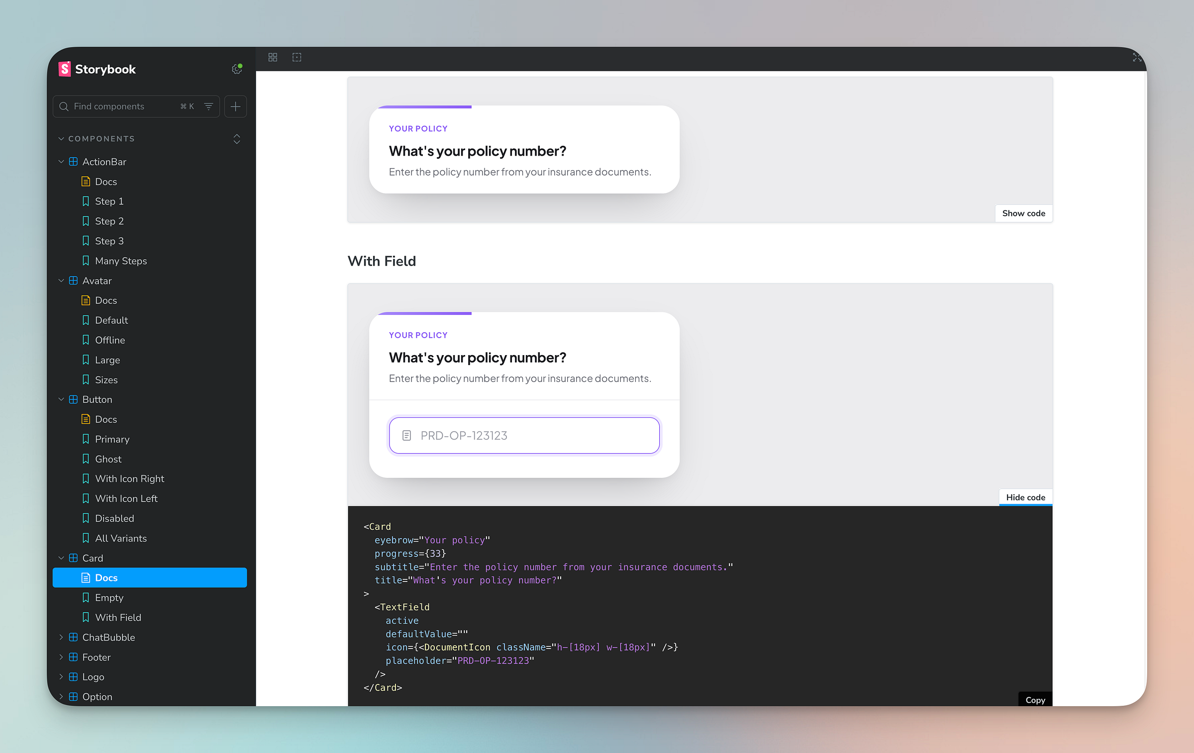
A built-in skill in cauliflower.studio handles the rest. The prototype components are exported to Figma as a proper design system — not a flat export, but structured components ready for designers to work with. At the same time, the corresponding Storybook components are generated: Tailwind-based, production-ready, and consistent with what was designed.
The result:
One Change, Three Outputs
The more important part is what happens when something needs to change.
In the traditional flow, a component change means updating the design in Figma, then updating the implementation in code, then verifying they still match. Three steps, minimum. Often more, if the change touches multiple screens or component states.
In this flow, the sync goes the other way: change the component in the cauliflower.studio prototype, trigger the sync, and both Figma and Storybook update automatically. The source of truth is the prototype — at least in the early stages of the project; once the design system is established, Figma will likely take over as the source of truth. Everything downstream follows.
That changes the economics of iteration significantly. Changes stop being expensive enough to avoid. The feedback loop between stakeholder input and production-ready output compresses from days to minutes.
What This Means in Practice
The output of this step is a Storybook component library built on Tailwind, the current market standard for component-level CSS in frontend development. Developers pull components directly from Storybook into application code. Designers work from the Figma design system that was generated from the same source.
There is no handoff gap. There is no “this doesn’t match the spec” conversation. The components in design and in code are derived from the same artifact.
For enterprise insurance software specifically, this matters more than it might in other contexts. Guidewire Digital projects involve long timelines, multiple vendors, and UI work that spans years. A design system that stays in sync automatically is not a nice-to-have — it’s the difference between a UI codebase that remains maintainable and one that drifts into inconsistency over twelve months of incremental changes.
The Full Cycle
At this point the loop is closed. The full sequence looks like this:
- Inspiration and concept — visual references, a prompt, a working HTML prototype in hours
- Process demo — the prototype extended into a demoable customer journey, driven by acceptance criteria
- Design system and component library — Figma components and Storybook entries generated from the approved prototype, kept in sync automatically
- Application development — developers building on a stable, consistent component library from day one
Each step produces something a stakeholder can react to. Each step validates before the next one begins. The cost of change is highest at the end and lowest at the start — which is the correct relationship, and the opposite of how most enterprise projects are structured.
This process is repeatable. It doesn’t depend on a particular insurance platform, a particular design tool preference, or a particular team size. It works wherever there is a digital product to build and stakeholders who need to see something before they can decide.
The author has worked in Guidewire Digital Portal development since 2018.