The UX Problem Nobody in Insurance Wants to Admit
I use more than five banking and fintech applications regularly. I can tell you within thirty seconds which ones I like and which ones I don’t. The difference almost never comes down to features. It comes down to how using them feels.
The good ones make you trust the institution. The bad ones make you wonder whether the people running the company actually use their own product. In insurance, the ratio of bad to good is worse than in banking. Forms that span dozens of wizard steps when a few would be enough. Progress bars that lie. Dropdowns where a conversational question would be faster and friendlier. The technical infrastructure behind these products is often solid, the surface the user sees is frequently very poor.
This isn’t a small problem. UX quality compounds into brand perception. An application that respects the user’s time builds loyalty in a way that no marketing campaign can replicate. An application that doesn’t erodes it, slowly and consistently, every time the user has to scroll back to fix a field they didn’t know was wrong.
A Different Way to Think About Insurance Wizards
Most insurance apps handle multi-step flows the same way: a wizard, a progress indicator, a series of forms, a submit button. If AI is introduced at all, it appears as a sidebar chat widget — a digital Clippy from MS Word sitting next to the form, ready to answer questions you weren’t planning to ask.
I wanted to try flipping that assumption.
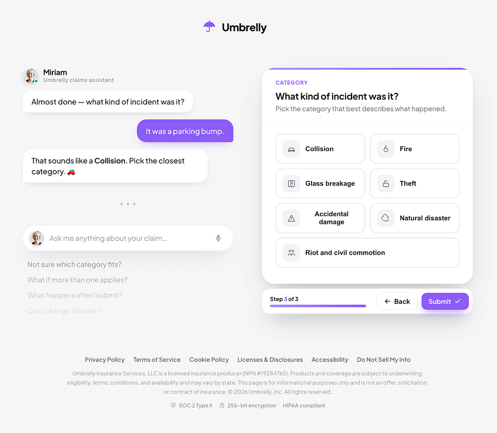
What if the conversational interface were the primary surface, not the assistant? Not “here’s your form, and there’s a chatbot if you get stuck,” but “an agent is guiding this process — it knows the context, it can fill in what it already knows, it can flag mismatches, and it can suggest relevant products where it makes sense.” The user still has control, but the default mode is conversation, not manual data entry.
The use case I chose to prototype: a new policy wizard within an insurance application. The kind of flow that today involves from ten to fifty questions, repeated data entry, and the occasional confused user who drops off halfway through.
Pinterest Boards and Production Code
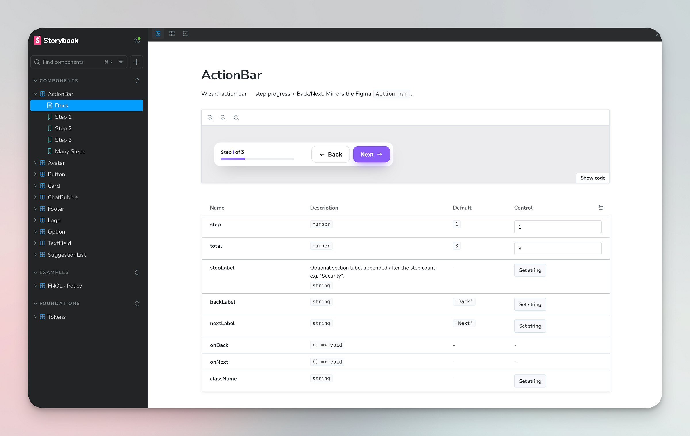
I didn’t start from a blank canvas. I gathered visual references from Pinterest — UI patterns that communicated warmth, clarity, and modernity.
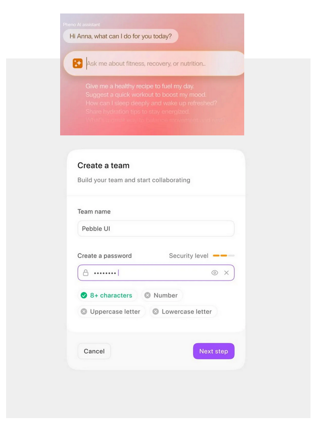
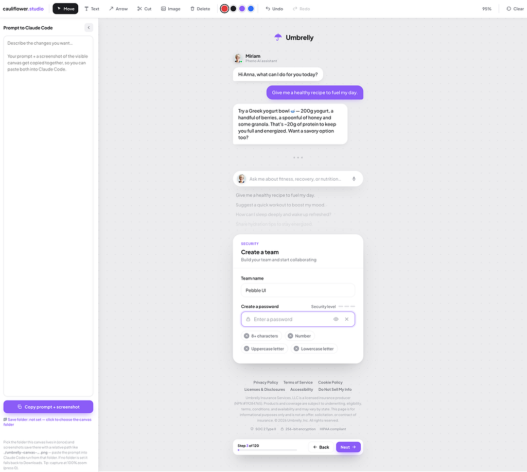
The prototyping tool I used was my own tool — cauliflower.studio, running Claude Code under the hood. The input was a concatenated screenshot of the reference images alongside a prompt describing the conversational wizard concept. What came back was a working HTML prototype — not a static mockup, not a Figma frame, but a functioning browser interface.
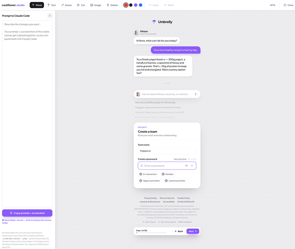
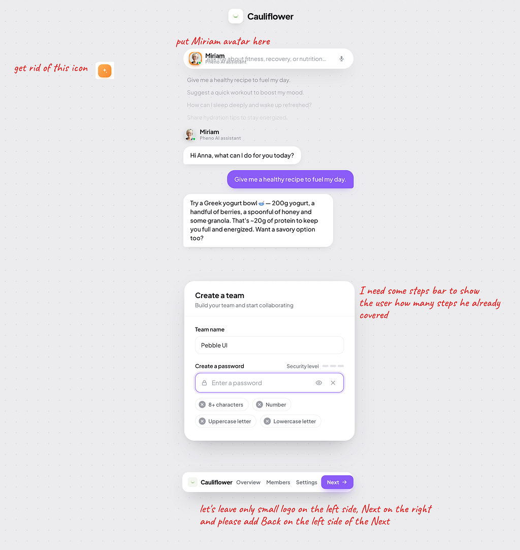
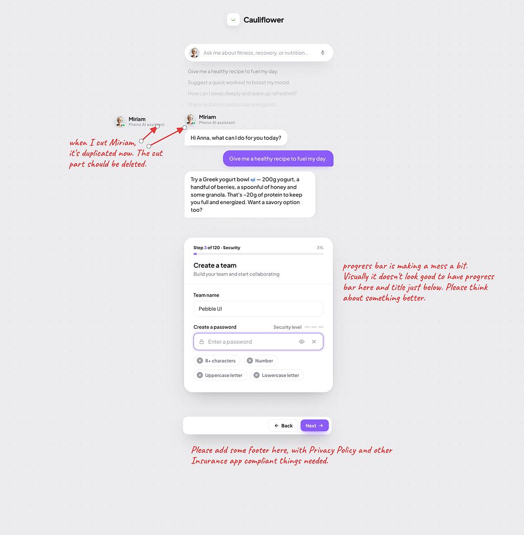
From there, the process was iterative: a few rounds of comments fed back visually into cauliflower.studio, each adjusting layout, interaction patterns, or content.
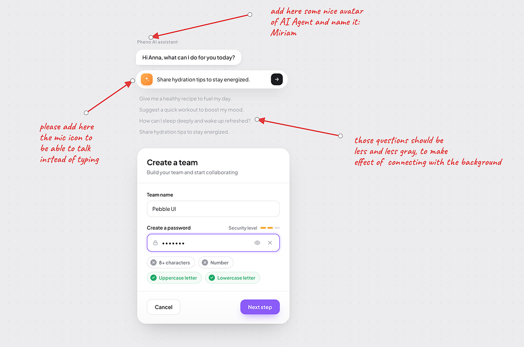
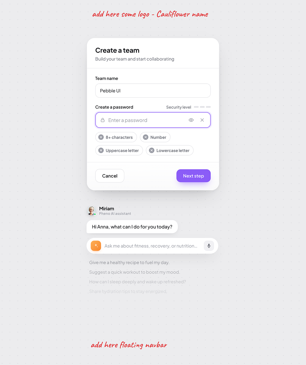
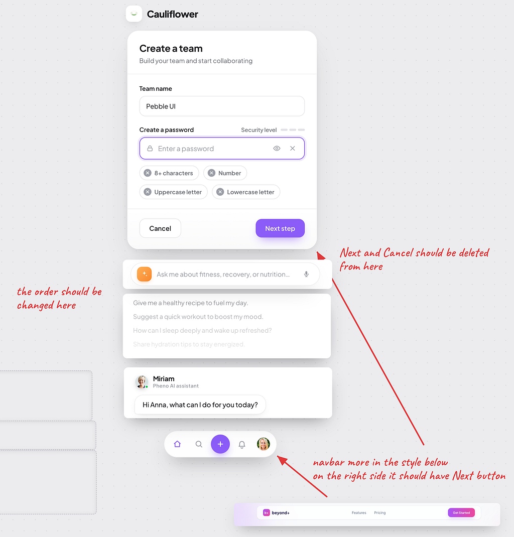
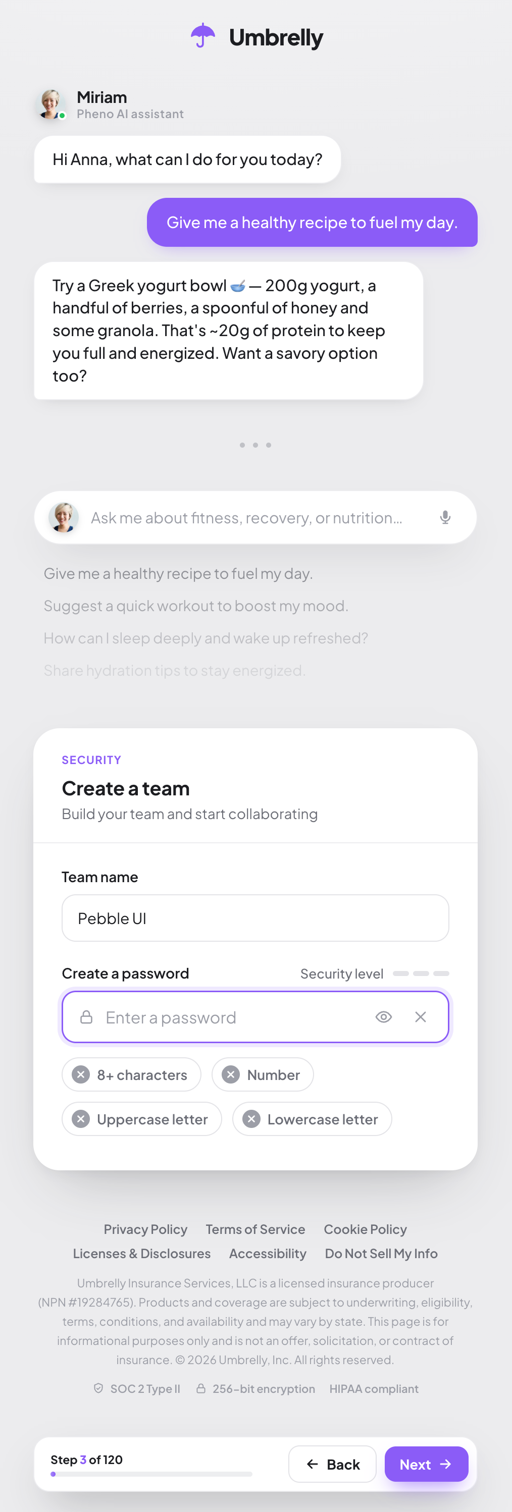
The result is something you could put in front of a client tomorrow (after adjusting dummy labels and copy ;)) — the interaction model is real, the page works, and the visual language communicates what it’s supposed to.
What This Is Actually Good For
The prototype is not production code. It’s the first step in a pipeline that I think is becoming the correct way to approach custom application development:
- Prototype in HTML — fast, interactive, testable with real users, demonstrable to clients
- Extract design components — generate Figma components from the working UI, not the other way around
- Generate a component library — Tailwind components derived from the established design, consistent and reusable
- Generate application code — real framework code, with engineering rules and acceptance criteria injected into the AI agent harness from the start
The advantage of this sequence is that business validation happens at step one, before anyone writes production code. By the time the engineering team picks it up, the UX has been stress-tested by actual stakeholders, not imagined by a developer interpreting a brief.
This is a reversal of the traditional flow — spec, design, develop, then show the client something they can react to. That sequence is expensive and slow. The cost of change compounds at every stage.
The AI Agent Layer Is the Real Differentiator
The conversational wizard isn’t just a UX choice — it’s an architecture choice with real downstream value.
An agent embedded in a policy creation flow has access to everything the form-based wizard does: the user’s answers, the product configuration, prior policies if the user is returning. But it also has the ability to reason about that context in ways a form cannot. It can recognize when a user’s described situation suggests a different coverage option than the one they selected. It can pre-fill fields based on earlier answers. It can flag inconsistencies before they become claims issues later.
The cross-selling opportunity is the obvious business case, and I think it’s the one that will get this in front of budget holders fastest. But the more durable value is friction reduction: every question the agent can answer in context is a question the user doesn’t have to go find in a FAQ, call a broker about, or abandon the flow over.
Done carefully, this is a better experience for the user and a better conversion rate for the insurer. And this is the core value proposition of digital transformation projects.
Final thoughts
The prototype took a few hours. AI-assisted prototyping doesn’t eliminate the need for good thinking about UX — it accelerates the translation of that thinking into something tangible. The judgment about what to build still has to come from somewhere.
What changes is the gap between concept and artifact. That gap used to be wide enough that bad ideas survived to production simply because killing them late was too expensive. Closing that gap is not a small improvement — it’s a structural shift in how custom application development can work.
For insurance specifically, where the UX bar has been low for long enough that raising it is a genuine competitive differentiator, the timing is interesting. The tooling is ready. The models are capable. The question is whether insurers will move fast enough to take advantage before the differentiation closes.
Some will. Most won’t.
The author has worked in Guidewire Digital Portal development since 2018.